Optimisation and High Impact Journey Redesign
Aviva Zero
Role
Product Designer
Product Team
Aviva Zero
Duration
5 months
Project
Problem
The initial solution would require customers to input their relevant data in the journey. The problem is that they would have input the same data into the aggregator site before coming to the Aviva Zero site. This would have meant a duplication of effort, when they got to Aviva Zero and risk of drop-off and conversion. The Proposition team wanted to address this and simplify the overall high-impact Aviva Zero journeys.
Solution
Led end-to-end design and strategy across Aviva Zero’s three core workstreams, reimagined the Quote Summary mobile web experience to personalise aggregator traffic and redesigned the New Business, Renewals with Change, and Mid-Term Adjustments journeys to improve conversion, clarity, and post-purchase flexibility.
Process
-
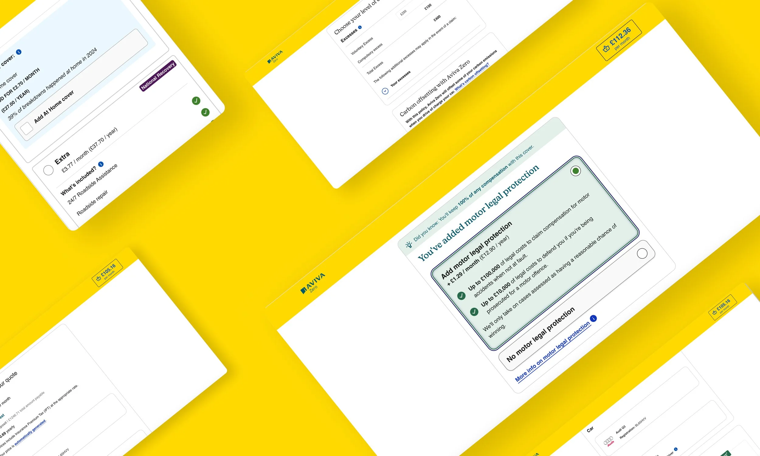
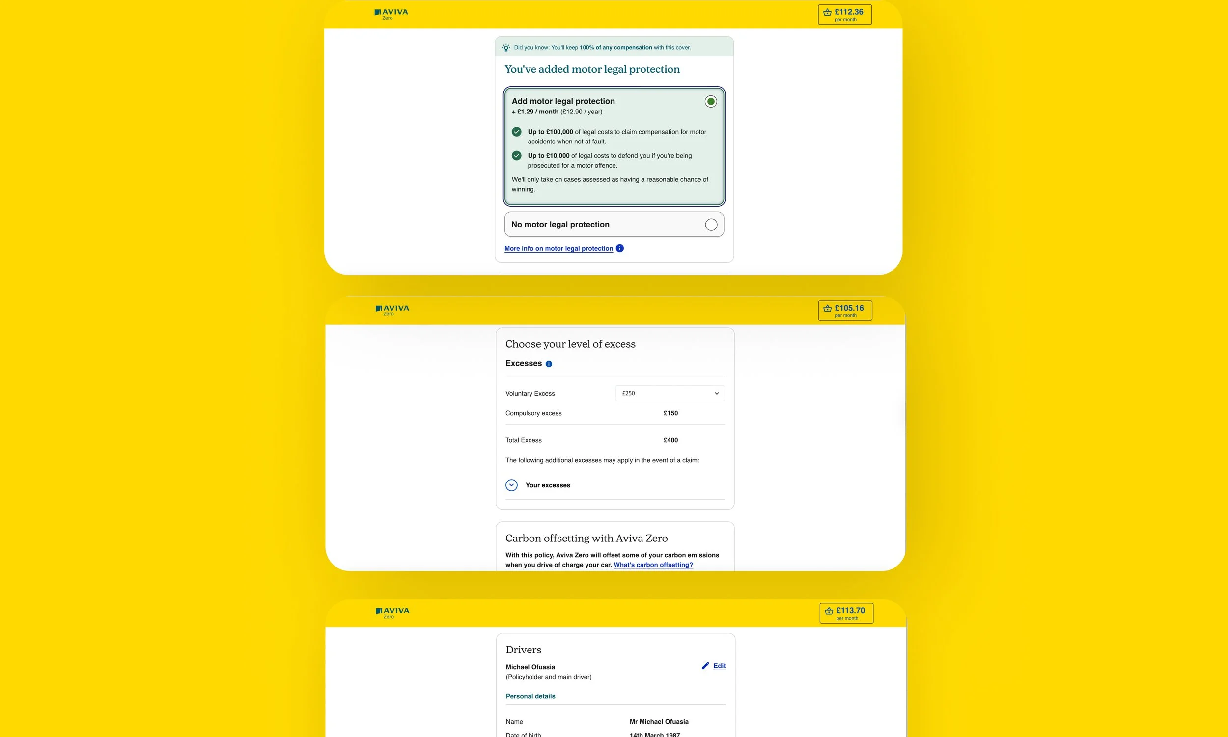
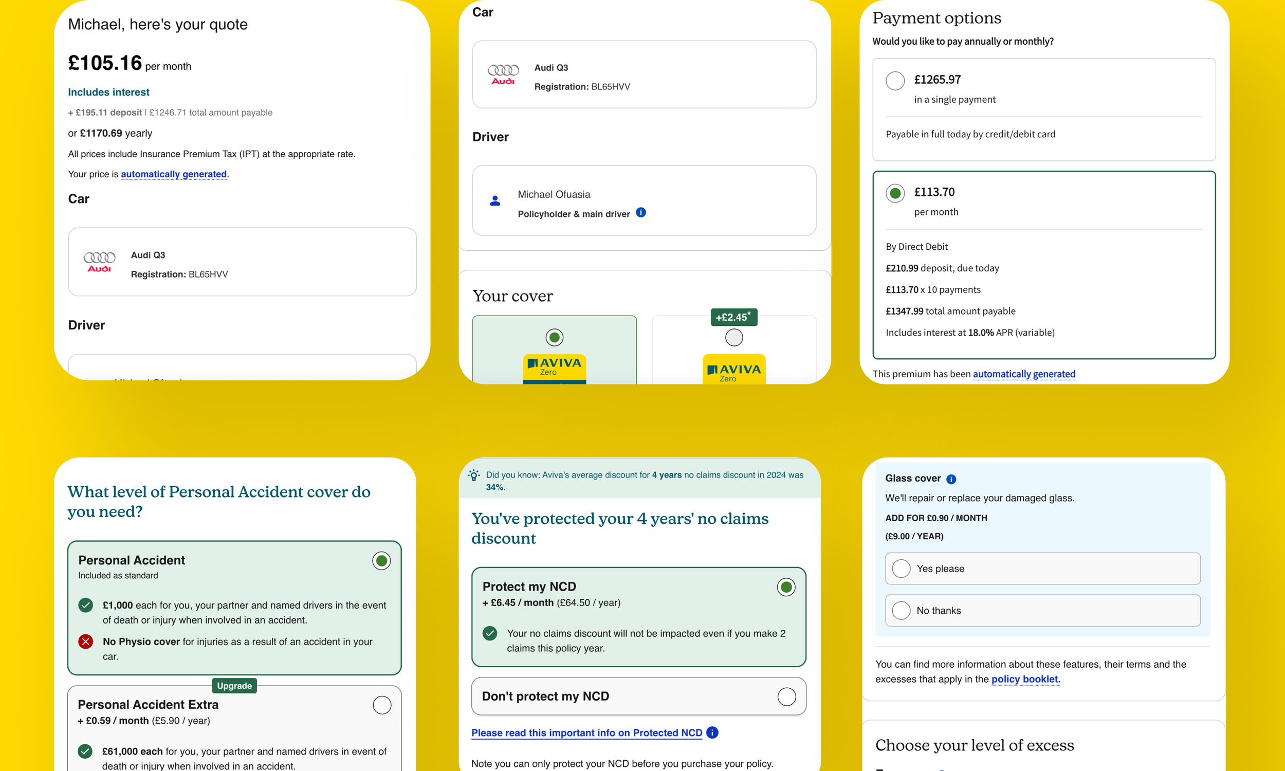
Noticing upcoming Design System updates and inspired by the opportunity for a cleaner experience, I reviewed the Quote Summary page for clarity and readability. The analysis showed that the information architecture wasn’t doing the job, key details weren’t scannable, cognitive load was high, and users couldn’t act quickly. I restructured the layout so customers could grasp essentials at a glance and move confidently to the next step.
-
I created five Quote Summary concepts exploring how the page should adapt when customer data was or wasn’t passed through from aggregators. Each option reorganised driver details, vehicle information, and policy specifics into logical, card-based groupings to improve scanability. I also removed the decorative car illustration—which added no value and wasted space—to deliver a cleaner layout that highlighted essential details and clarified the next actions.
I presented the concepts to the Product Team, and we A/B tested the variations to identify which design delivered the strongest optimisation and conversion uplift.
-
I iterated on the initial designs based on feedback, adding a clear monthly-vs-yearly comparison so customers could make a fair, informed choice—regardless of the preference captured on the aggregator site. This allowed customers to change from monthly to yearly (and vice versa) at the point of sale
-
Quote Summary Page
Using Figma’s Dev Mode, I marked the work as ready for build, though throughout the whole process, I held calls and demos with the development team, ensuring the designs were feasible to deliver.
Following some requirement changes, I ran a multi-disciplinary ideation session to work on features to support the requirements
Redesign
I redesigned the landing page following the workshop and included a number of features such as search and the ability for users to submit multiple claims.
After a review with the team, it was decided that for MVP we would simplify the design and add search and multi-claim functionality to the backlog.
Impact Highlight: Quote Summary
Reimagining Aviva Zero’s Quote Summary mobile web experience, accelerating performance with a £500k YoY revenue uplift (+1.3%) through clearer information design and stronger personalisation from aggregator traffic, shortly after going live.
High Impact Journey Business Outcomes
The redesign of Aviva Zero’s core journeys—New Business, Renewals with Change, and Mid-Term Adjustments—saw a reduction in drop offs, and boost conversions.