Delivery Design
Aviva Simple Wealth
Role
Product Designer
Product Team
Aviva Simple Wealth (nee Navigator)
Duration
7 months
Project
Problem
Research into our customer segments exposed a major gap: many mass-affluent customers were earning well and sitting on investable cash, but lacked the knowledge or confidence to make their money work, and couldn’t afford an independent financial adviser. They had the means, but no guidance. That insight made the proposition opportunity unmistakable and defined the problem we needed to solve.
Solution
We designed a hybrid advice model that blended automated robo-advice with human touchpoints, all delivered for a one-time fee. Users could input their goals, receive a tailored investment fund aligned to their time horizons, and speak with a human adviser whenever they needed clarity. It created a guided, confidence-building journey that made goal-based investing accessible to people who’d never had this level of support before.
Process
-
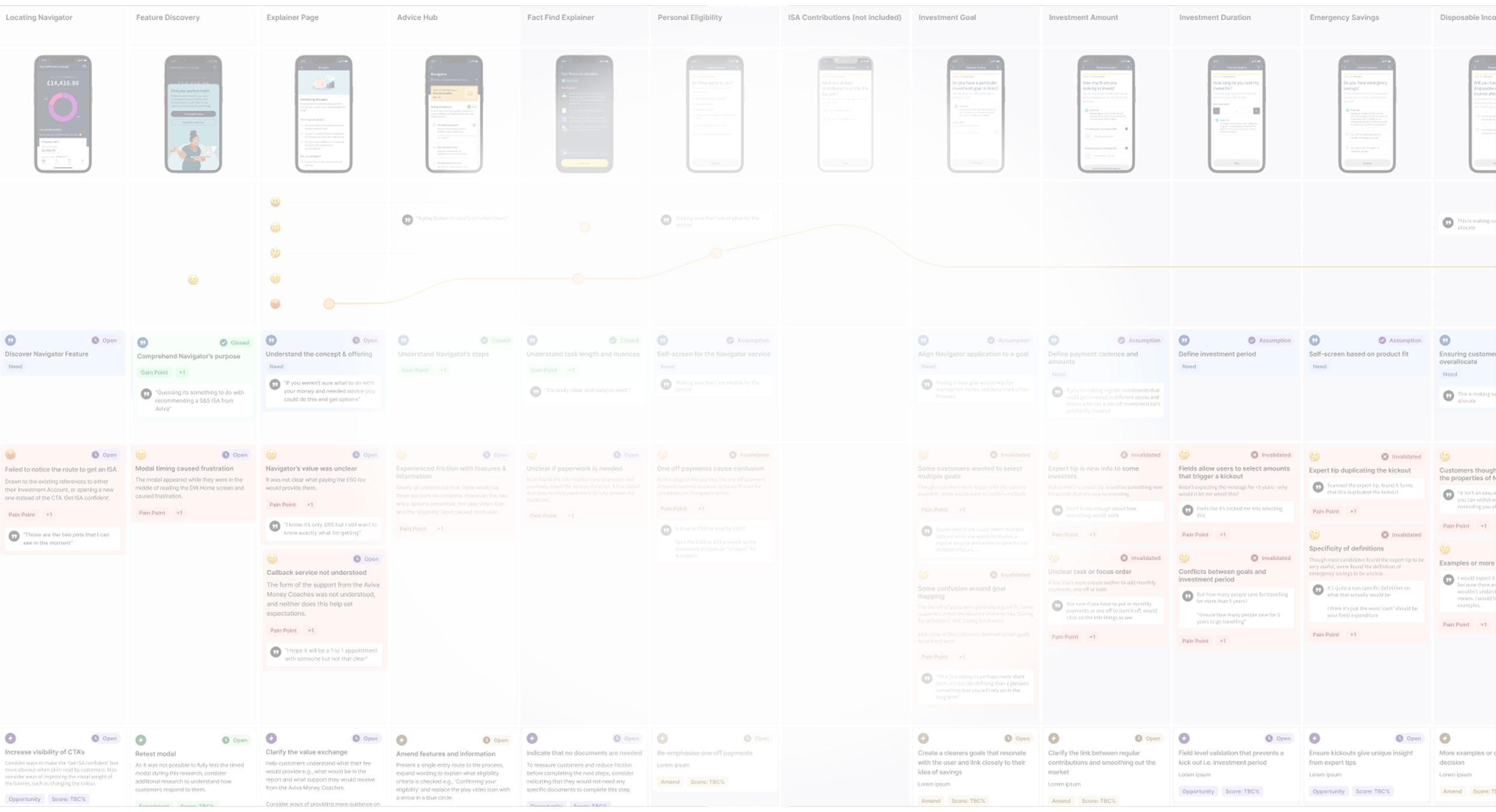
Although an agency delivered the initial discovery, concepts, and testing, I joined two designers for a journey-mapping session to break down what we’d inherited. We analysed the flow end-to-end, pinpointing friction points, simplification opportunities, and moments where we could add genuine delight.
Very quickly, I spotted that the onboarding question set wouldn’t meet FCA or Consumer Duty standards. Working closely with BAs and the Senior Propositions Manager, I mapped every regulatory requirement and surfaced the gaps so we could redesign the journey compliantly without compromising experience.
I also ran a trendscape analysis — looking at how FS competitors structured onboarding, how non-FS brands simplified complex disclosures and education, and how we could make goal-setting both digestible and motivating. This work reframed the early journey and set the foundation for a cleaner, compliant, and more user-centric onboarding experience.
-
With compliance and legal pushing for heavy FCA-aligned content, I flagged that the onboarding journey was becoming overly complex and would create significant cognitive load. I recommended a simplified structure that still met regulatory requirements but protected the user experience.
Concerned about fatigue and drop-offs, I designed celebratory moments at the end of each section to reward progress, along with chapter screens that set expectations — what’s next, how long it takes, and why it matters for their financial goal. These elements turned a dense, compliance-driven flow into a clearer, more motivating journey.
-
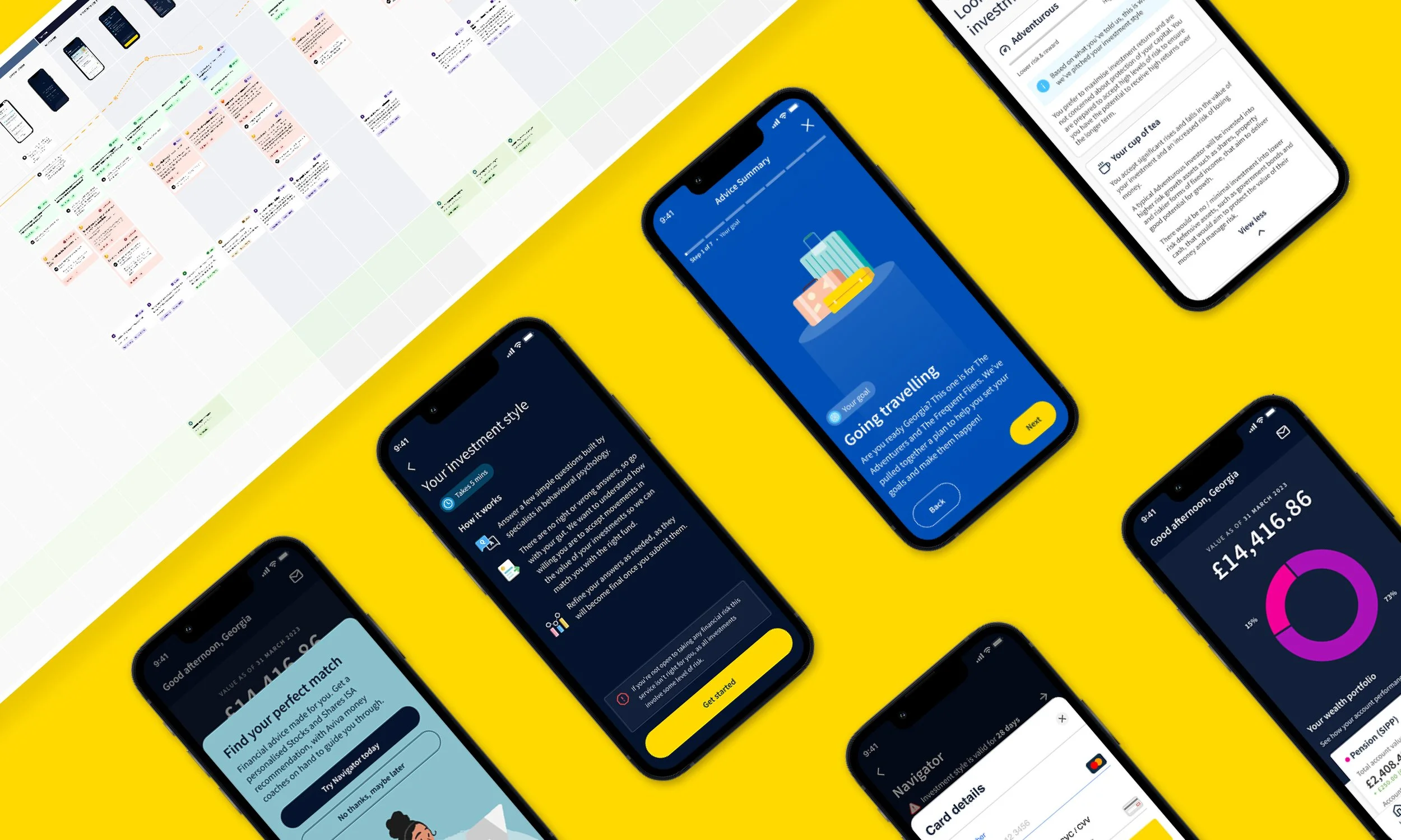
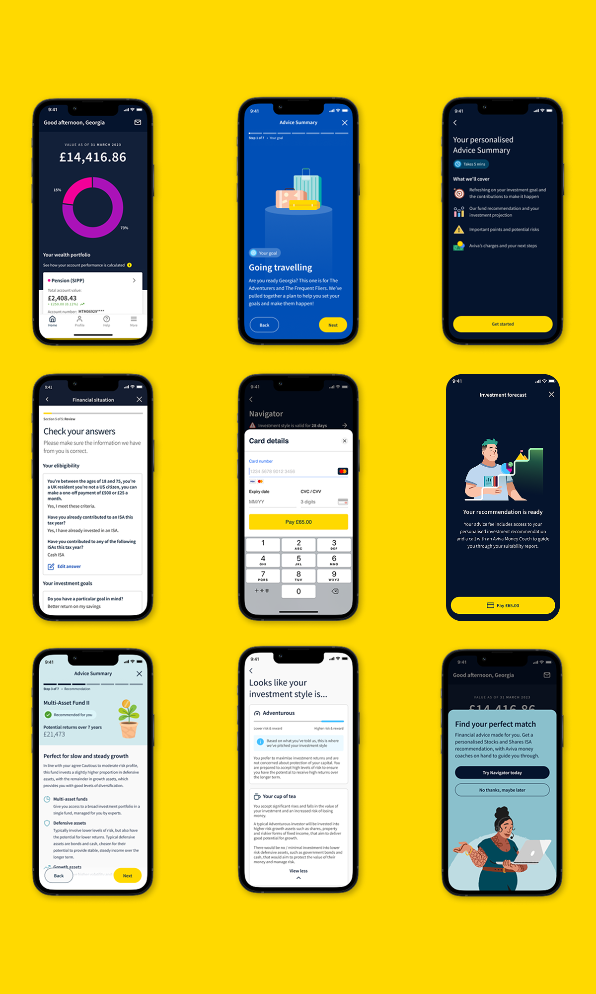
Once we’d defined the sprint priorities, I moved into designing delivery-ready screens for onboarding — covering all states, edge cases, and kick-outs — while simultaneously exploring concepts for the Hub, Investment Style, and Investment Forecast sections.
One issue stood out immediately: if a customer was removed from the journey due to eligibility or affordability, simply blocking them wasn’t good enough. They needed to understand why they couldn’t proceed and what alternatives existed. I redesigned the kick-out experience to provide clear reasoning, guidance on what to improve, and signposting to other Aviva or partner services — turning a dead end into a constructive moment.
After completing onboarding, I applied the same clarity-first approach to the psychometric question sets that shaped the user’s investment style. I simplified the output into an easy-to-navigate experience (tea-based metaphors included — and yes, they landed well with stakeholders).
I then designed the Investment Forecast area, giving users a visual model of their projected outcomes, along with a seamless call-booking flow to access adviser support when needed. This work created a coherent, end-to-end foundation for the proposition’s core journey.
-
I partnered closely with developers throughout the sprints, joining planning, refinement, and playbacks while creating new design-system components and walking engineers through the logic behind each experience. This ensured the build stayed aligned with the intent of the design.
Midway through, we hit a complication in the goal-setting flow: updated ISA rules meant users could easily exceed their annual allowance, which directly affected contribution logic. I sat down with the Proposition PO and BA to map every scenario, redefine the rules, and design clear labelling and error states that guided users to adjust their contributions without breaching limits.
Throughout delivery, I ensured all designs met WCAG AA standards, providing detailed accessibility mark-ups for every screen so the final product was compliant and genuinely usable for all customers.
Forecast Feature
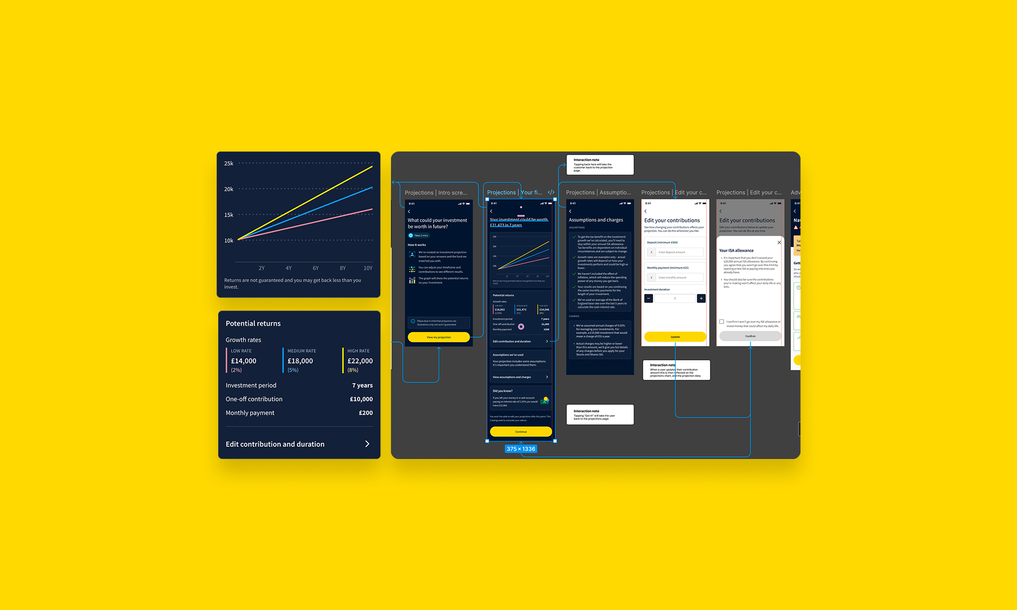
For the Investment Forecast section, my goal was to help users explore the real potential of their investment based on the contributions they set during onboarding. Powered by a stochastic model, the experience showed their lowest, medium, and highest projected returns over their chosen horizon.
I made sure users could compare these outcomes against leaving the money in a savings account and understand exactly how the projections were calculated. I also designed controls that let them adjust contribution amounts and investment duration to see the impact instantly. The feature resonated strongly in user testing, giving users clarity, confidence, and a sense of control over their financial future.
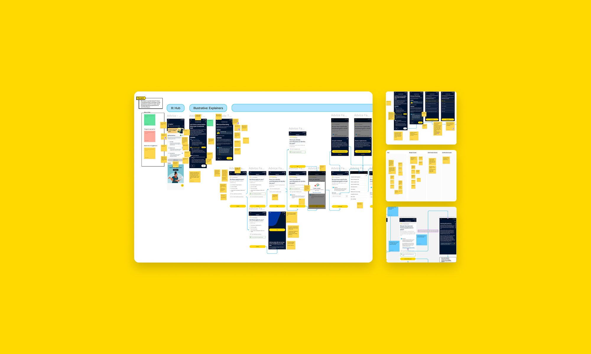
Chapter Page | Design Review
To bring the chapter page concept to life, I took the designs into a Design Review I was leading and had the team assess the journey end-to-end before focusing on the chapter screens. Their feedback helped refine the content order, highlight key elements, and simplify the messaging even further.
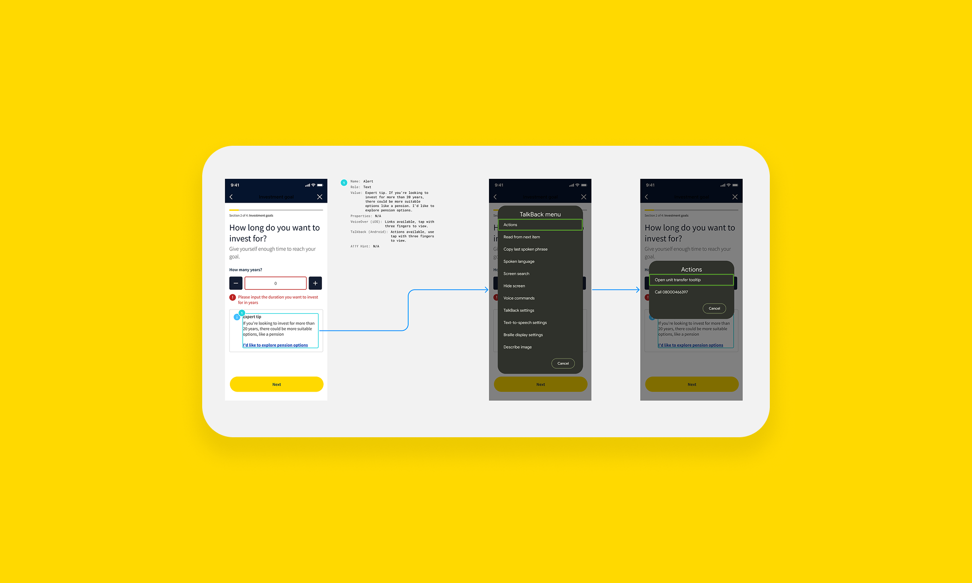
Accessibility Mark-ups
For every screen, I created manual accessibility markups (our plugin was unusable) to avoid repeating a previous audit failure and the commercial risk that comes with inaccessible products. In refinement sessions, I walked developers through each markup and explained how the interactions should behave with a screen reader, making accessibility a fully collaborative effort between Design and Engineering.