Redesign
Expense Portal

Role
Product Designer
Product Team
Help | CR Portal
Duration
11 months
Live site: *Feel free to use fictitious data, but DO NOT SUBMIT A CLAIM.
Project
Problem
When raising expense claims customers would have to navigate a clunky expense form, that made it challenging to submit more than one expense type in a single transaction. This caused some user dissatisfaction as well as errors when submitting the form.
There was also a business need to migrate from one platform to another and to harmonise the portal with the new Design System without any service interruptions.
Solution
The solution was a simplified expense journey, with an improved experience whilst avoiding any association / brand issues due to legacy system functionality and design.
Process
-
Due to the short timeframe given to complete this work, any user centred principles came from a look at good practice across industries in how components are used in interaction design.
-
Analysis
I analysed the current expense process, portal to understand how the components related to the processing of an expense claim, with frequent questions posed to the Product team.
I also had a review of the new Design System to understand which components would best serve the user in achieving their goal of raising an expense.
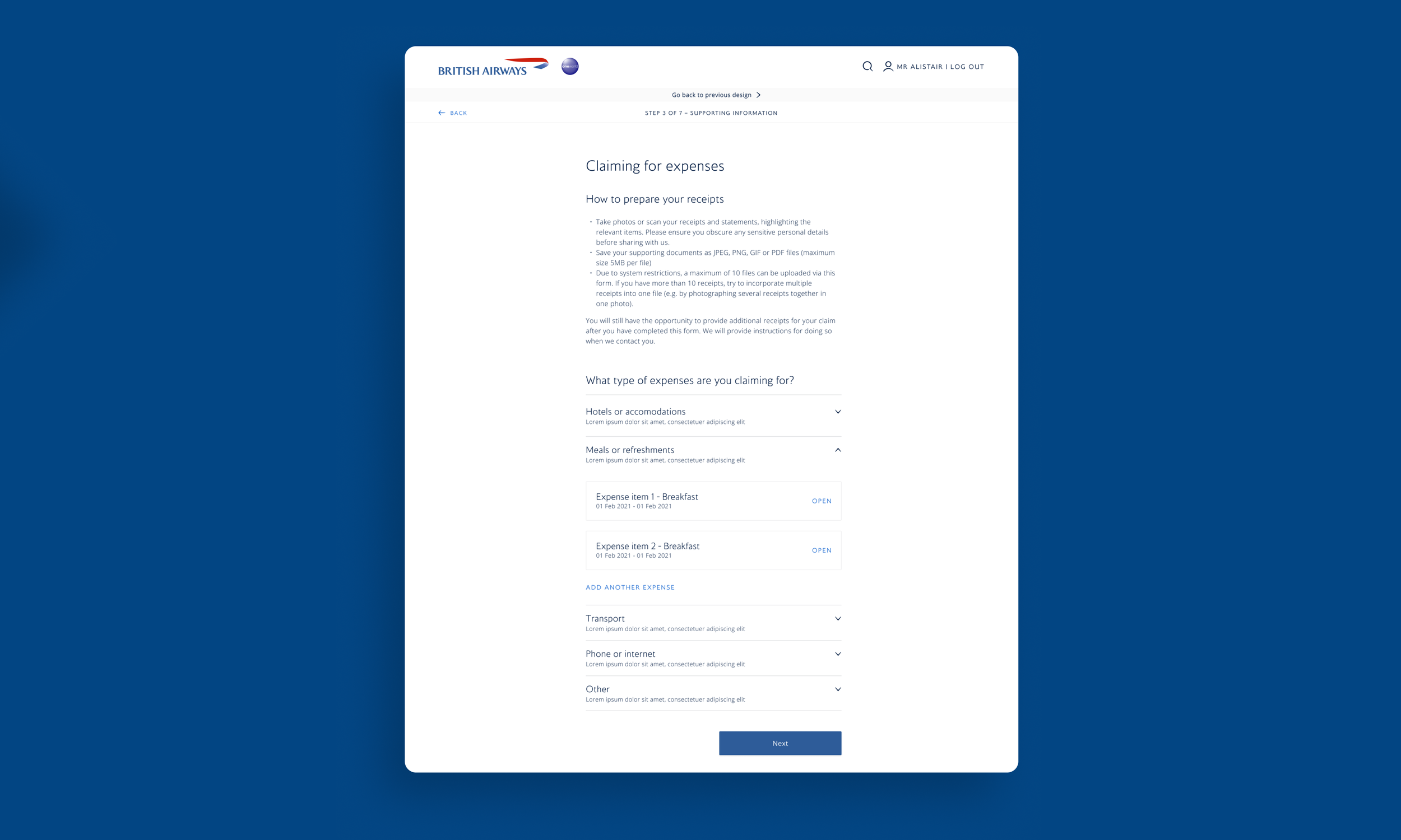
I then demoted the bottom six categories, to increase the findability of the more prevalent categories.
-
Sketching
I sketched a few options that would align with the new Design System.
In addition to this, I was in constant contact with the Design System manager and the Devs about the feasibility and if new components could be created by combining components that already exist in the design system.
I was able to successfully redesign the flow using the components in the new Design System, whilst simplifying the process, by adding some new features e.g. saving multiple expense items and being able to go back and edit, remove them from the overall claim without losing data, and undoing the removal.
The new design gave the journey a more linear flow.
-
Handoff
Following agreement on the designs from the team, I suggested that due to the lack of user research done, we should observe the site analytics to inform design changes and test those.
The designs were then handed to the Dev team via Figma to build in the Beta environment, and they are presently live.
Upload File Component
The new Design System didn’t have a file upload component and the expense journey, amongst others, required one so customers could attach supporting documents for their claim or issue.
Considering accessibility, usefulness, usability and the requirement to inform customers of the limitations of the file upload feature, I designed a new file upload component that was large enough, instructive, informative, and styled according to brand guidance.
This feature has been shipped and is now live.

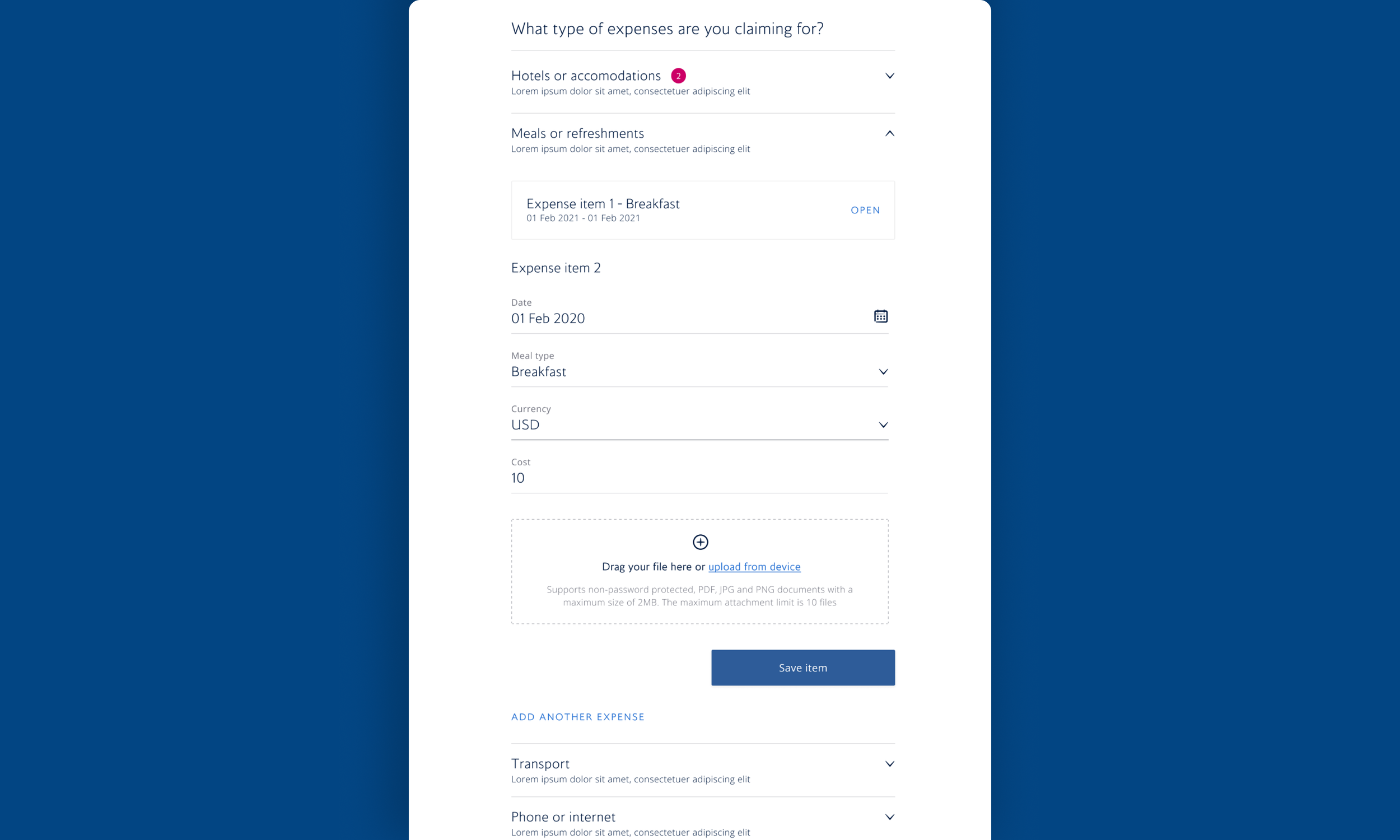
Undo & Restore
In order to raise multiple claims a customer would have to get to the end of a single expense transaction to then add another expense type to their claim. To address this I designed a feature where customers save their expense within the form and then add another expense. Within this feature, I enabled customers to see their saved expense item, open it for editorial purposes and to remove it in the event they added the expense item in error.
Having considered a neurodiversity angle I wanted to remove the inertia and anxiety caused by mistakingly removing an expense item, so I added an undo feature to the expense type component.
All of this has been shipped and is now live with the exception of the undo feature as there needs to be some accessibility issues resolved.
Summary
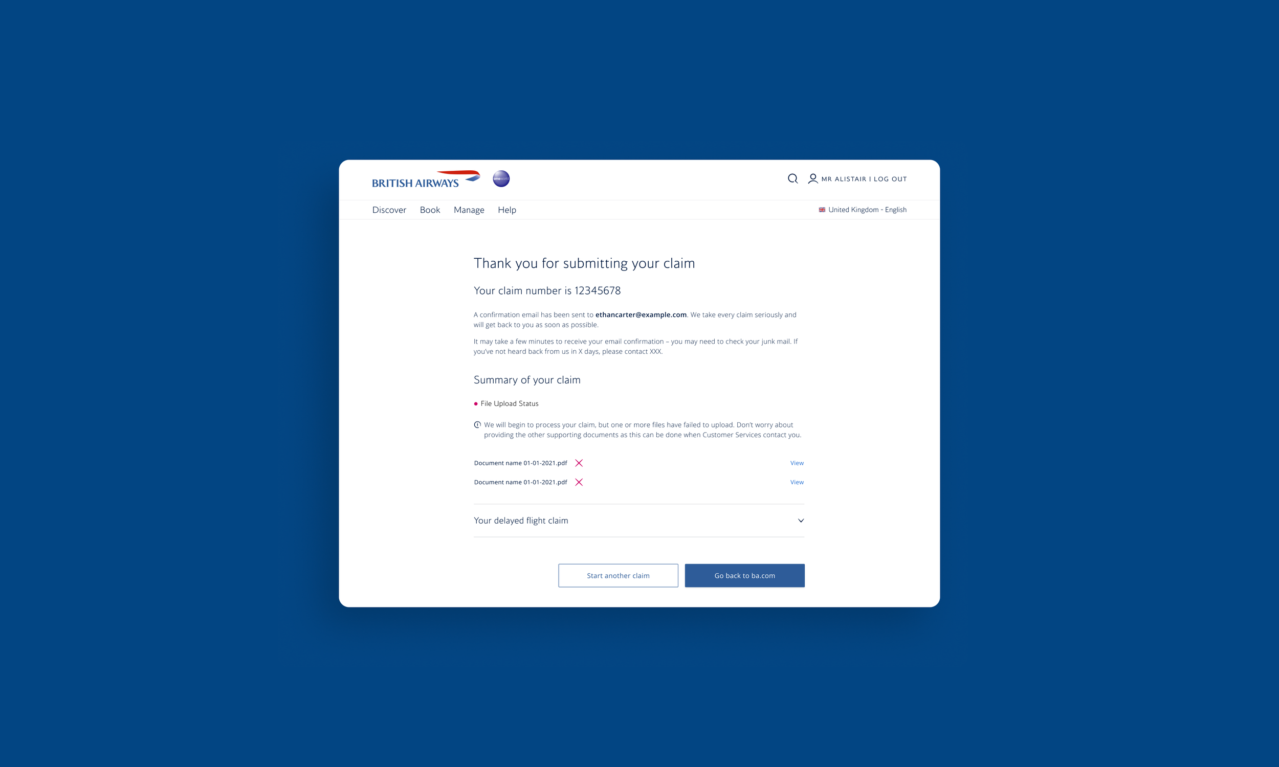
I designed a Review page, which enabled customers to review their expense claims and make edits to any errors they noticed upon review. The proposed design I delivered enabled customers to edit the details in-page without having to go back to the section that required attention. The shipped MVP did not include the in-page edit.
I also Summary page that allowed customers to see the full details of the claim they had submitted. There was a requirement for this page to show customers if any attachments didn’t load successfully and inform them that the claim will process will begin, and supporting documents can be provided once Customer Services contact them. I designed this so customers could see the actual document itself.