Redesign
Landing Page
Role
Product Designer
Product Team
Help | CR Portal
Duration
11 months

Project
Problem
Due to customers struggling to navigate the CR portal the Customer Service Centre (CSC) was inundated with calls to the point they were unable to manage the volume. As a result customers were not getting the help they needed, customers couldn’t get through to the CSC, and calls were being dropped.
Solution
Redesign and improve the current Complaints and Claims portal with an aim to increase task completion and increase contact deflection to the customer services centre by enabling better self-service via the landing page.
Process
-
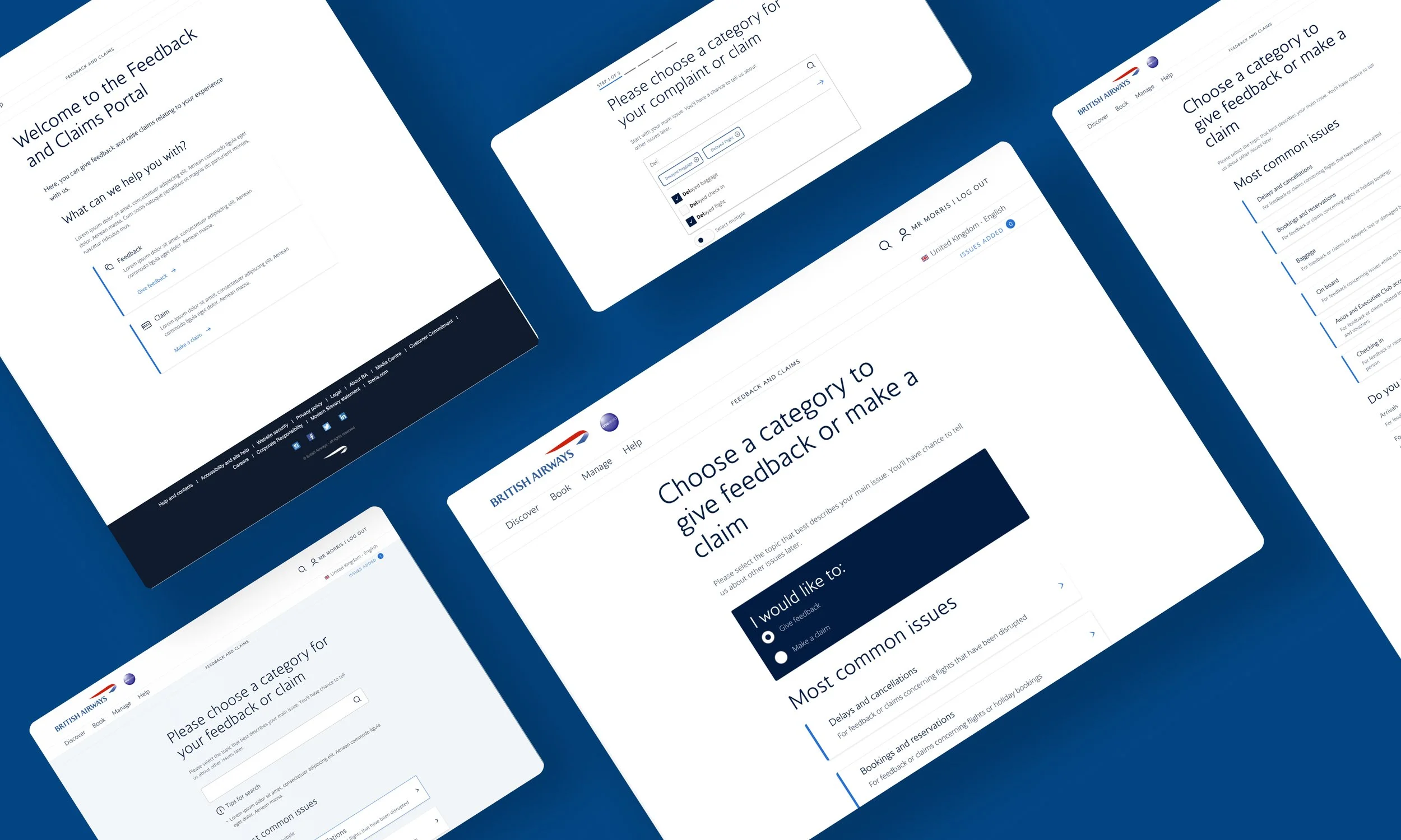
When using the British Airways Complaints & Claims Portal, customers struggle to locate the right category to raise their claim or provide feedback, resulting in erroneous task completion or a high bounce rate on the site at this point of the journey.
As a result of being unable to raise complaints and claims properly digitally, many customers resort to either calling or emailing the Customer Service Centre, who are overwhelmed with the number of cases - unable to deliver a quality service, thus impacting the brand.
-
Analysis
In analysing the current Portal experience and the available data, I made a decision to promote the top six categories that had the highest call volumes in order based on the highest volumes at the top - The assumption was that customers need to transact in these categories the most.
I then demoted the bottom six categories, to increase the findability of the more prevalent categories.
Experiment
Following the analysis and defining a hypothesis and approach, I began drafting low-fidelity options for a solution to the problem.
These helped arrange the information on the page based on our findings.
-
After designing some options I presented them to the team to vote on, and three options were chosen to discuss in a workshop.
After assessing the designs against the requirements and the tech constraints, we opted for option 1.
-
Redefine
From our card sort and tree test exercises, we identified that the category labelling was problematic. I suggested adding descriptors to the categories to help users make better-informed decisions.
Following some requirement changes, I ran a multi-disciplinary ideation session to work on features to support the requirements
Redesign
I redesigned the landing page following the workshop and included a number of features such as search and the ability for users to submit multiple claims.
After a review with the team, it was decided that for MVP we would simplify the design and add search and multi-claim functionality to the backlog.

The Reason Behind The Change
Based on research and experimentation that was conducted customers were unsure what kind of transactions they could make within each tile. The discoverability of the right issue to raise was not good, and the cognitive load appeared to be fairly heavy impacting decision-making.
This design was then improved upon through a number of iterations to reduce cognitive load, improve usability, and increase discoverability of the correct issues to raise to enable higher task completion.

Search & Multi-claims
I designed a type-ahead database-generated search feature, that allowed for multi-claim selection within the search bar in a way to enable customers to see their selected claims whilst searching for other categories.
I redesigned the landing page with a toggle to enable multi-claim functionality, where checkboxes would appear on each category tile to allow the customer to choose multiple categories for their claim.

Journey Triage
I designed a few options to help users choose a complaint journey or a claims journey.
I then redesigned the landing page, creating space for better descriptors by removing the icons.